Hence, an introduction of a new series: Inspiring your Aesthetic.
This will be a fun, easy series. Each post will include one picture from my collection, usually fashion related. Generally falling into either Steampunk, Lolita, or Gothic. There may be some architectural or interior design ideas. Maybe others. I'll explain what elements appeal to me about this picture, what can apply to me, and how I can add more of these elements to my daily life. Unfortunately, most of these pictures were collected long before I thought of sharing them on my blog, so I don't have credits or references. If you recognize one, please let me know where it is from so I can link back.
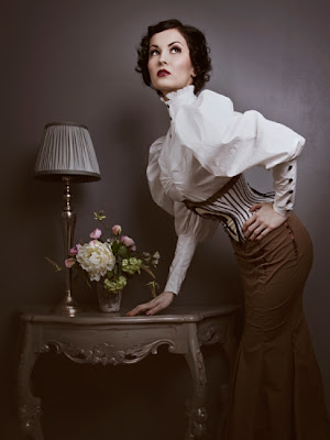
What I love most about this photo is the color composition. Everything matches without being monochrome. The wall matches the lampshade, which transforms into the pewter lamp, which connects to the glossy finish on the table. The woman's outfit matches as well. The white of the shirt matching the color of her corset while the corsets accents pull in the brown of the skirt. Then the position of her hands, the empty space created by her arms, the tilt of her torso contrasted against the horizontal lines of the table- it is a beautifully composed piece which, like a flower arrangement, improves the longer I look.
Unfortunately, the look itself doesn't work on my body type. The colors themselves would be flattering and practical- I always think cream and brown are a lovely combination. However, my shoulders are broad enough that they excess mutton sleeves would make me look ridiculous. Considering I've never found a pencil skirt to flatter my hips, I doubt I'll find a fishtail dress that will. However, as a cleaner version of the traditional Victorian bustle, it works nicely on this model.
I do like some of the details. The tight wrists with the dark buttons alluding to spats is an interesting idea and relatively easy to do. If the sleeves were a little less full and mutton-y, I'd like the cut off at the elbow. The lack of sleeves would be neat and clean. No accidentally knocking a glass over with a sweeping gesture. The high neck with the ruffles is also a good touch, and the gathering at the bodice.
As for the decoration, I like it. Not for my entire house and probably not so minimal, but for a room? That grey is a beautiful color to paint the walls and I love how the complex carvings of the table contrasts with the simple lines of the lamp. The flowers add a touch of life and softness to the otherwise dead elements. As an entry way, with that the table for the mail? Yes.
Unfortunately, being a poor grad student with one room to my name, there is little direct aesthetic I can glean from this picture. There are a few lessons I can take forward:
~ I like the complementary colors. When choosing outfits or thrifting, I can look for pieces that match what I have in my closet better.
~ The dominant color scheme of my room is brown and red- yet all my furniture is varying shades of brown. This summer, I can buy some stain and darken the wood to a richer brown to match the red. I should also choose my accessories with more care- a more dominate theme might be beneficial.
~ I like the high collar and the button arms- those might be able to replicate in a shirt.
~ I can try to declutter many of the flat surfaces I have around my room. Make them a little less chaotic looking and a little more stylish.
Was there any inspiration that you drew out of this picture?

No comments:
Post a Comment